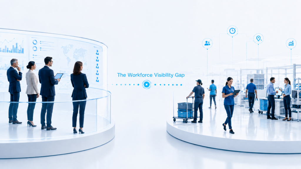
Many organizations already have dashboards.
They display engagement scores, absenteeism, turnover, benefit utilization, maybe even EAP usage. The interface looks modern. The charts are clean. The numbers are current.
But a dashboard is not intelligence.
For CHROs and People Analytics leaders, the question is not whether data exists. It’s whether that data is guiding confident, proactive decisions—or simply reporting what happened.
The difference between visibility and clarity
A dashboard provides visibility. It shows multiple metrics at once.
Wellbeing intelligence provides clarity. It answers:
- Where is risk emerging?
- Which cohorts are most affected?
- Is the situation improving or deteriorating over time?
- Did our last intervention change anything?
Without those answers, even sophisticated dashboards become retrospective summaries.
The common pitfalls of wellbeing dashboards
Enterprise HR dashboards often fall into predictable traps:
1) Metric overload
Too many indicators dilute focus. Leaders see dozens of metrics but struggle to prioritize action.
2) Lagging signals dominate
Turnover, claims, absenteeism, and exit feedback are valuable—but late. They describe outcomes, not precursors.
3) No segmentation discipline
Organization-wide averages mask variability. If one function is under strain while another thrives, a blended score hides both stories.
4) No longitudinal story
Single-period readings do not reveal trajectory. Leaders need to know direction—upward, stable, or declining.
These gaps are not technical. They are strategic.
What a wellbeing intelligence system does differently
Wellbeing intelligence organizes data around actionable patterns.
Instead of asking, “What is the score?” it asks:
- Which teams show sustained stress signals?
- Where is belonging eroding?
- Are certain demographics experiencing different trajectories?
- Do improvements correlate with operational adjustments?
This is the shift from descriptive reporting to decision support.
Why executives care about this distinction
Boards and executive teams increasingly ask for:
- Early warning indicators
- Evidence that investments are moving outcomes
- Cohort-specific insights
- Clear prioritization logic
A dashboard can show numbers. It cannot, by itself, create foresight.
For organizations managing thousands of employees, foresight reduces financial risk: lower regrettable attrition, fewer burnout-driven exits, stronger performance stability.
Turning dashboards into intelligence
If you already have reporting infrastructure, the goal isn’t replacement—it’s refinement.
1) Reduce to leading indicators
Identify which wellbeing dimensions meaningfully precede retention or performance issues.
2) Trend consistently
Establish cadence. Review changes over time—not isolated snapshots.
3) Segment intentionally
Align segmentation to how leadership decisions are made: by function, geography, manager ecosystem, tenure, or demographic cohort.
4) Tie insight to action
Every review cycle should end with a decision: maintain, intervene, redesign, or monitor.
When wellbeing becomes part of operational rhythm, it stops being an HR side metric.
Where Pietential fits
Pietential provides a structured wellbeing intelligence layer rooted in Maslow’s hierarchy of needs—helping organizations measure holistic employee wellbeing, identify gaps across cohorts, and track change over time.
It complements existing dashboards by adding pattern visibility and decision clarity—helping leaders determine whether workplace wellbeing is improving and where to act next.